

ICN – An introduction
The ICN System is a universal, practical and easy-to-understand colour order system for design, communication and analysis of colour in many application areas — Architecture, Design, Industry, Research, Art, Fashion and Education.
—
The problem
today
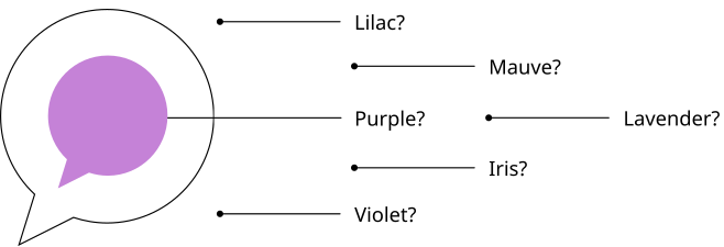
We all perceive and describe colours differently due to differences in language, culture, geographical location, and biological makeup. Even the material of the object affects the way we see the colour.
In the English language, there are hundreds of ways to describe the colour Purple!
Therefore, we need to develop a common language to:
- Describe the colour we see
- Communicate the colours and colour combinations we want
- Make colour choices swiftly and accurately
—
Our
approach
How do we actually see colour?
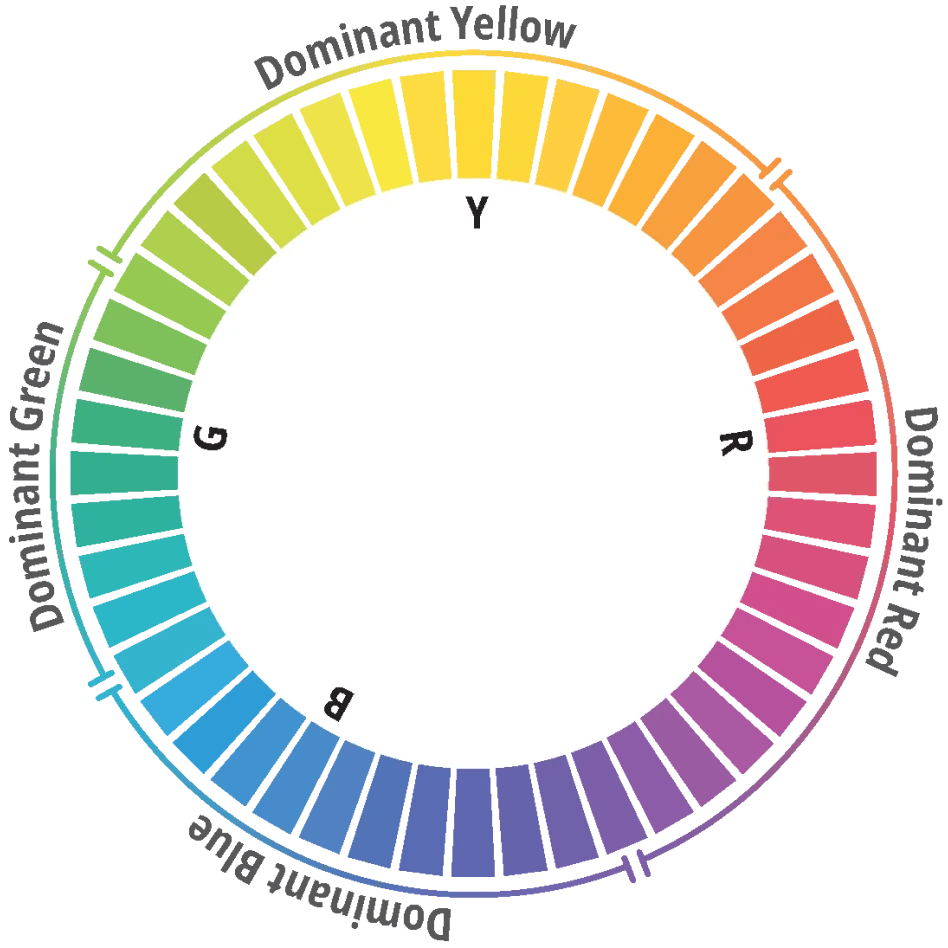
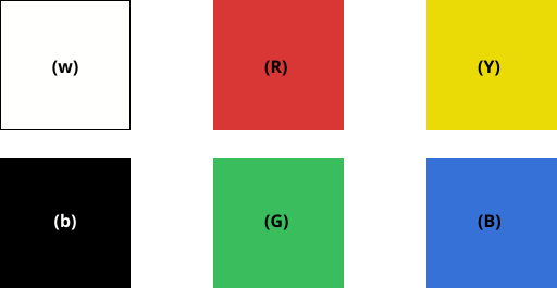
In human colour perception, there are 4 very unique chromatic Hues:
- Red (R) vs Green (G)
- Yellow (Y) vs Blue (B)
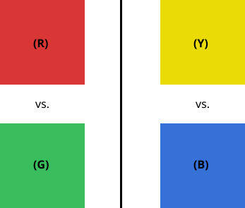
These are the "Psychological Elementary Hues" and act as anchor points. All other hues are described with their relative "similarity" to the neighbouring two elementary hues.
—
Describing
Hues
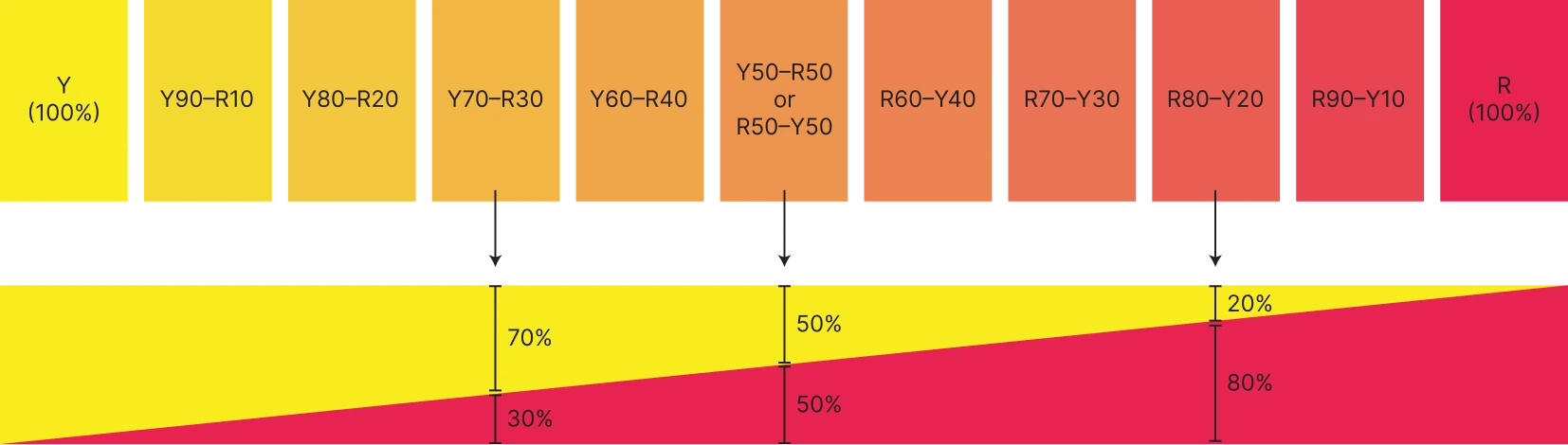
Between Red (R) and Yellow (Y)
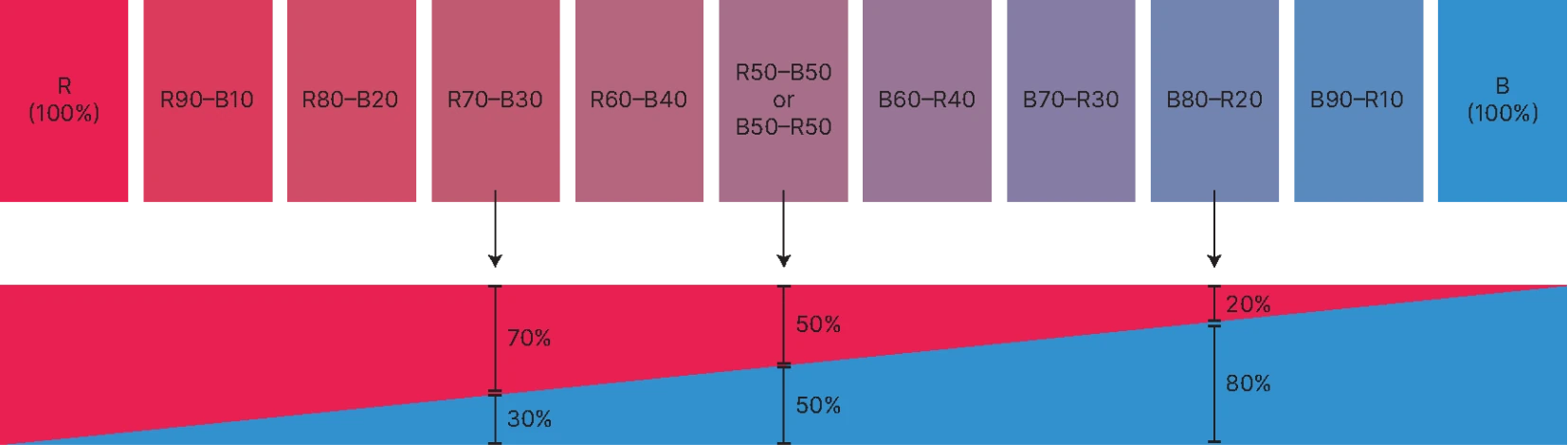
Between Red (R) and Blue (B)
Between Blue (B) and Green (G)
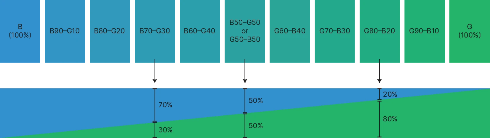
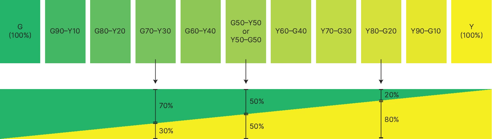
Between Green (G) and Yellow (Y)
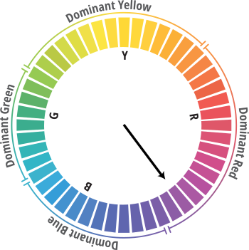
By placing all the hues in a continuous flow, we get the ICN Hue Circle.
So now we can describe hues by how similar (in %) they are to the 4 Psychological Elementary Hues.
For example:
R80-Y20
This colour is
80% similar to Red (R),
20% similar to Yellow (Y)
R
(100%)
This colour is
100% Red (R)
R80-B20
This colour is
80% similar to Red (R),
20% similar to Blue (B)
—
Adding
Nuances
Adding 2 more anchor points in our perception
We are able to describe the Hue of a colour, but this is not yet sufficient because a colour can have more properties, like how whitish or blackish it is. So now we have to determine the shade (or nuance) of the colour.
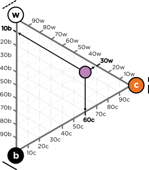
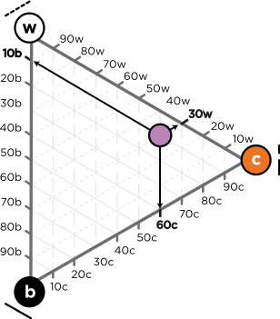
We judge the Nuance of a colour by:
- How similar it looks to Pure Whiteness (w)
- How similar it looks to Pure Blackness (b)
- How similar it looks to Full Colour (c)
- w + b + c = 100%
The inter-relation between whiteness, blackness and chromaticness forms a complete Nuance description.
The example on the left shows the Nuance description of 30w10b60c.
—
The ICN
Notation
The complete ICN Colour Notation
This is the complete description of how our colour looks. It is a blueish Red, quite chromatic, slightly whitish and a bit blackish as well.
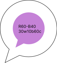
Hue: R60-B40
Whiteness: 30w
Blackness: 10b
Chromaticness: 60c
With the help of 6 anchor points; Yellow, Red, Blue, Green Black and White, any colour can be described in a meaningful way. Most importantly, we can now describe colours in an intuitive and unambiguous way, without having to do mental gymnastics to fill in the missing colour information.

—
Connect
with us
Contact ICN for consultation or advice tailored to your specific needs. Our team of experts is here to support your journey toward a more refined and meaningful form of colour communication.
Colour advisory: Get expert guidance on building or optimising your colour collections, ensuring they meet market demands and align with your brand identity.
Licensing opportunities: Access our digital and physical tools for seamless integration of the ICN system into your workflows, whether for product development or design curricula.
Training and workshops: Empower your team or students with specialised training programs designed for top design and architecture institutes.